Ballezza — We went red too.
The color red is both a curse and a blessing. We often see it, which means people know what it’s about. Pizza, anyone?
-
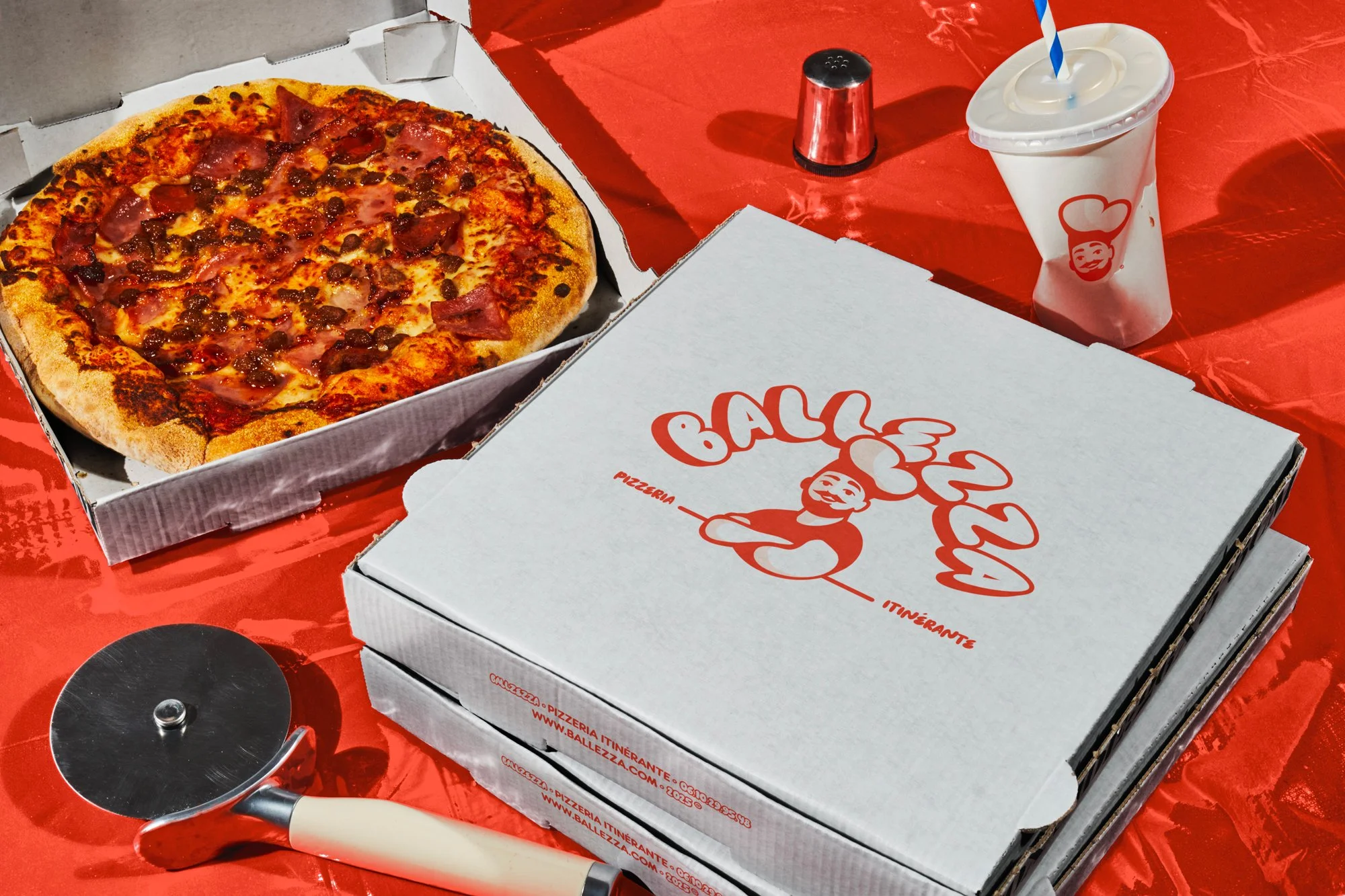
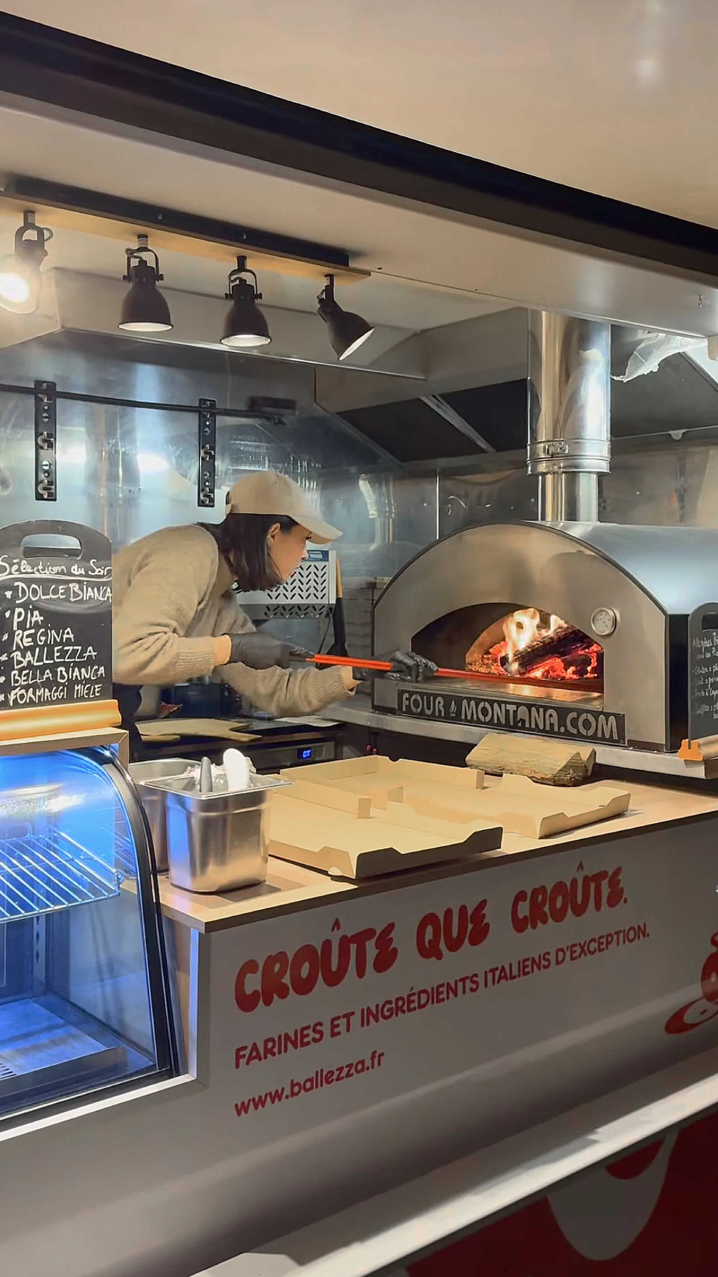
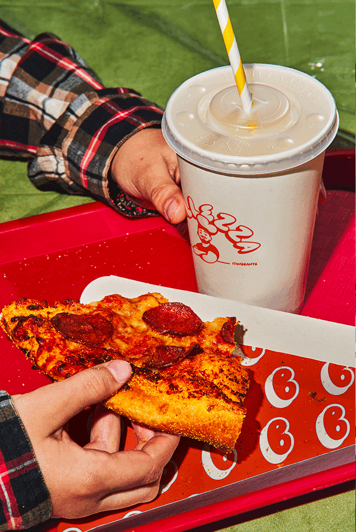
A product people are already convinced about: pizzas – Neapolitan, carefully sourced, flavor handled; we trust our client completely. Our job is to make sure people enjoy the view of the pizza box just as well– double pleasure, in every bite and every glance.
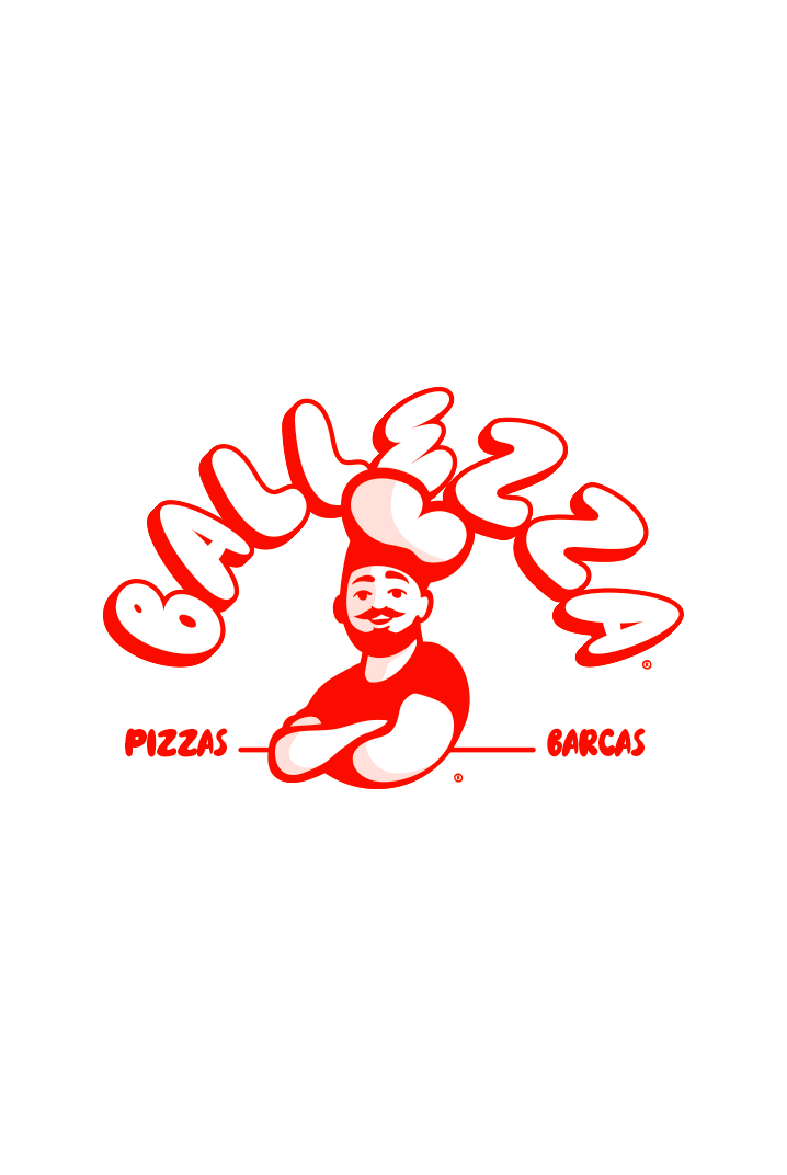
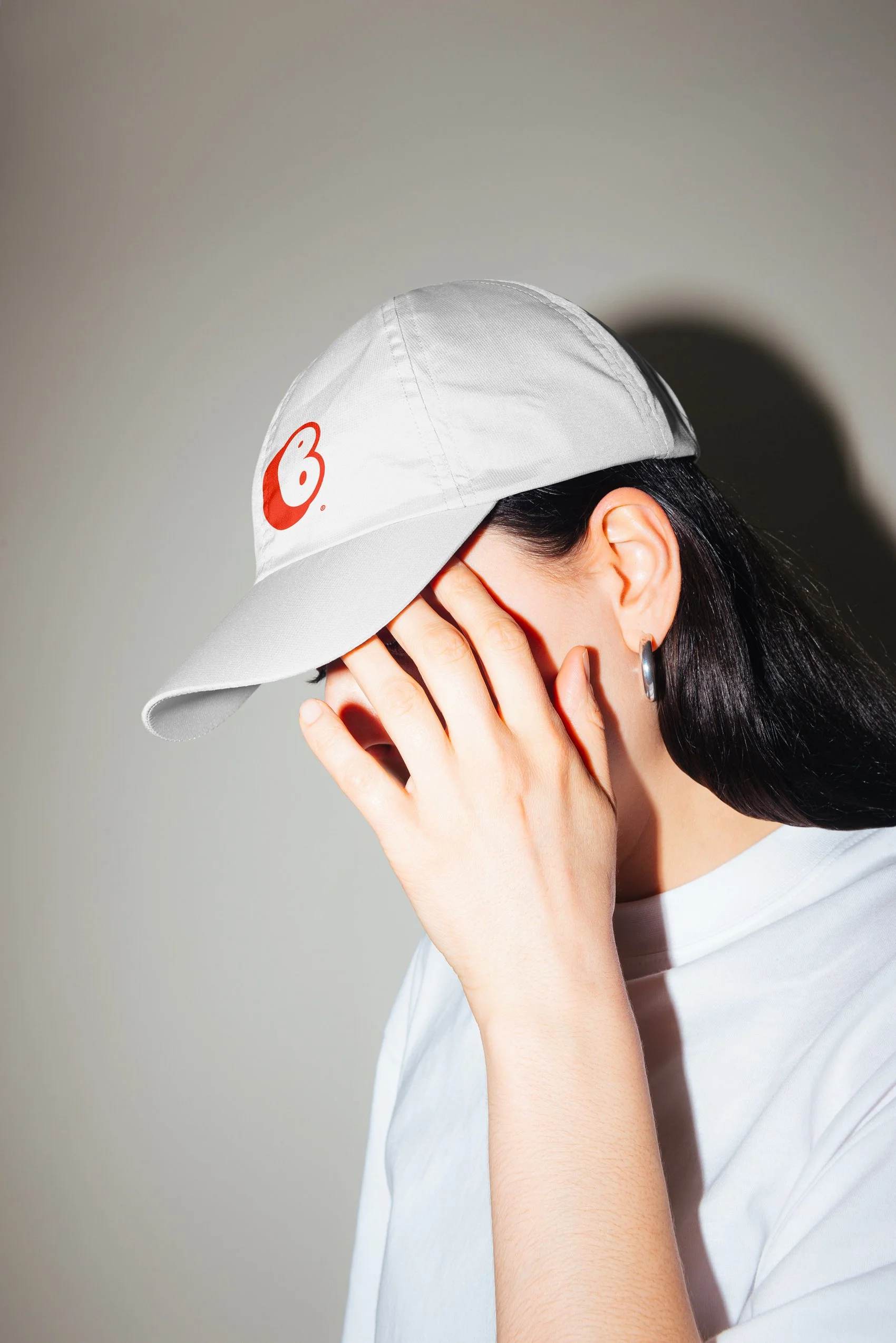
Ballezza is a playful blend of Ballet, Alexis’ last name, and pizza. It made perfect sense to reflect him in the brand.
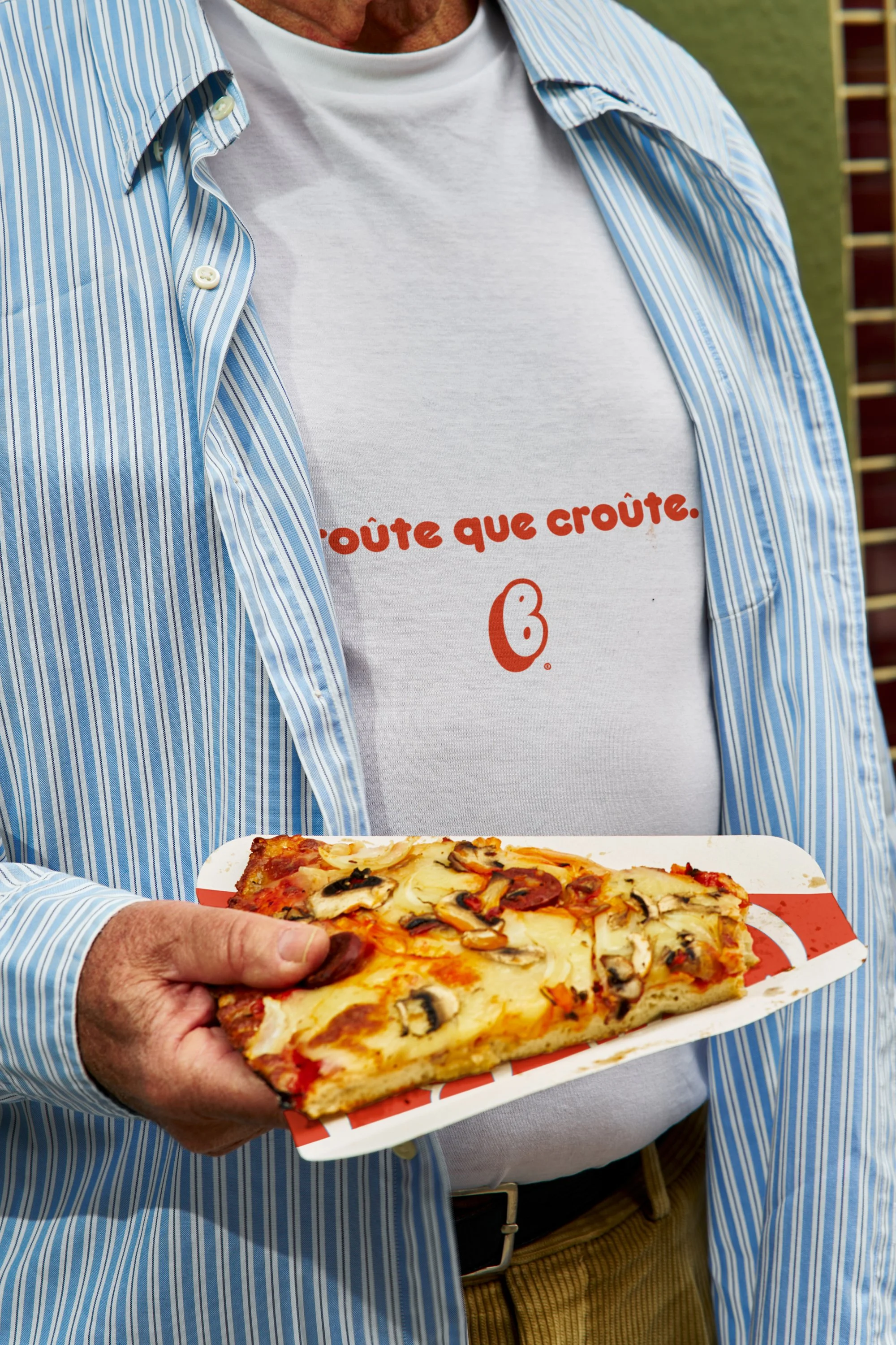
Alexis wanted a cartoon-inspired style, but the project’s cohesion came from the Nok typeface. Rounded, with precise details, it guided the illustration and ensured the visual language cohesive. And the red? We had considered a different palette at first, but ultimately… we love red too.
Scope:
Brand Identity
Copywriting
Print
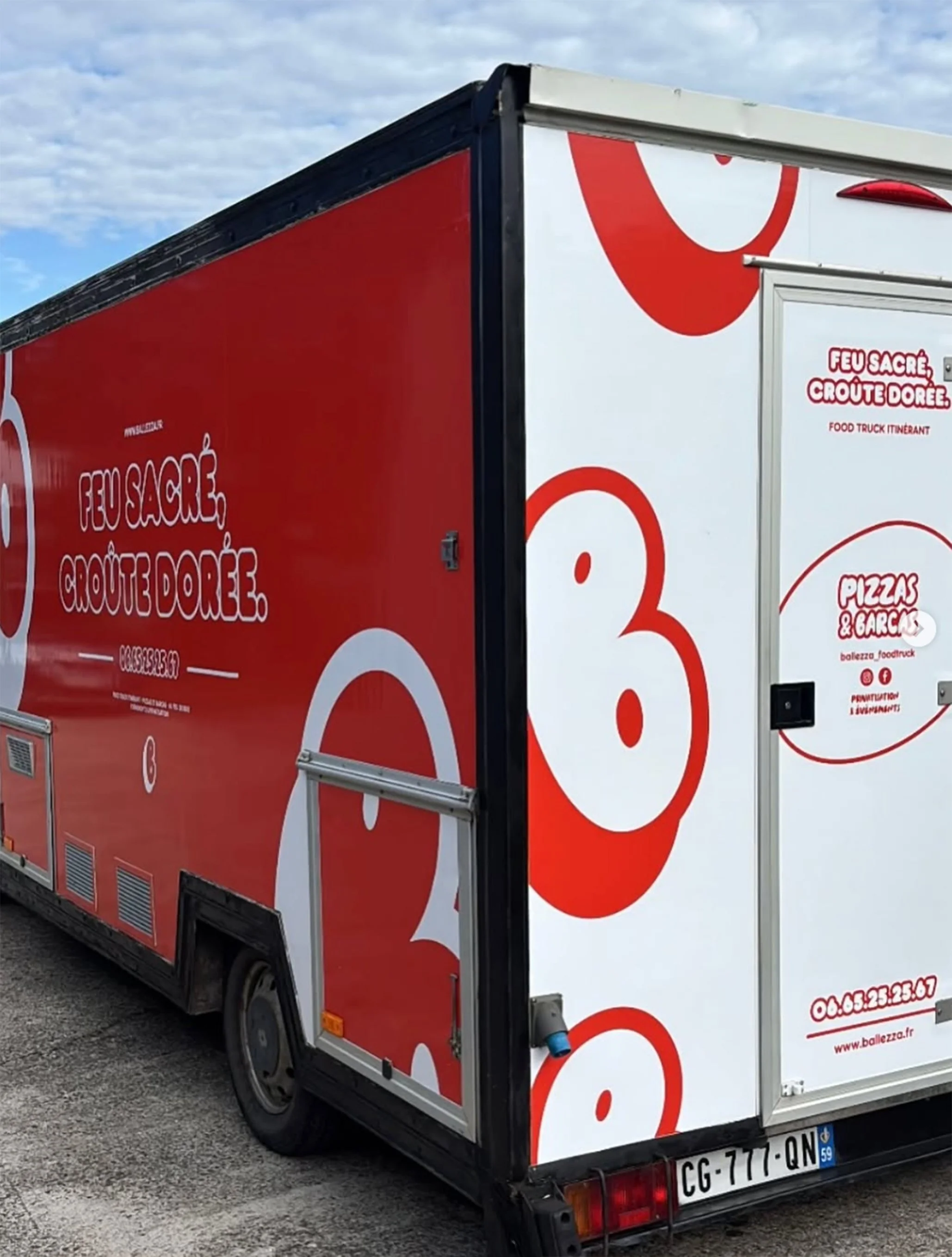
Vehicule design