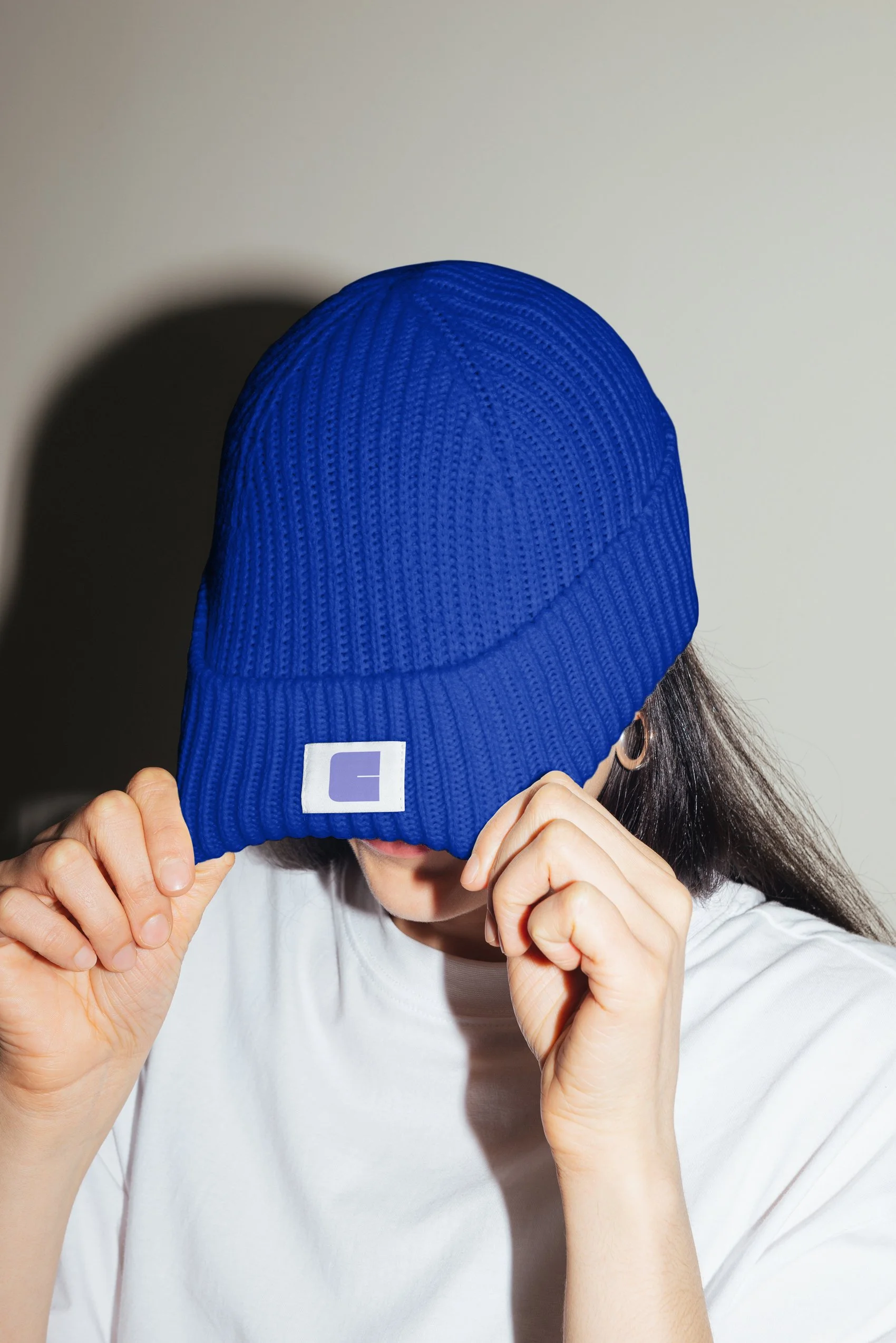
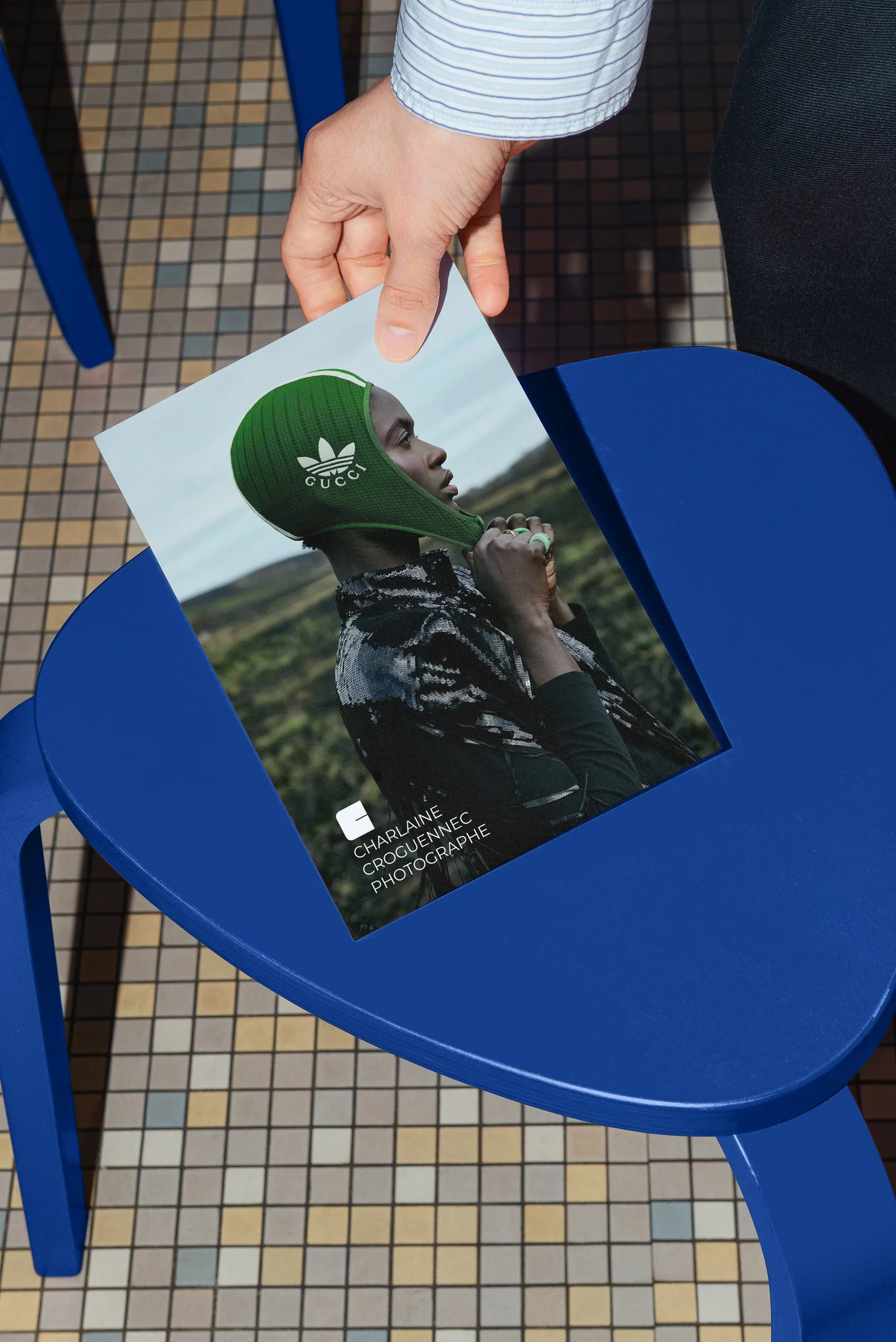
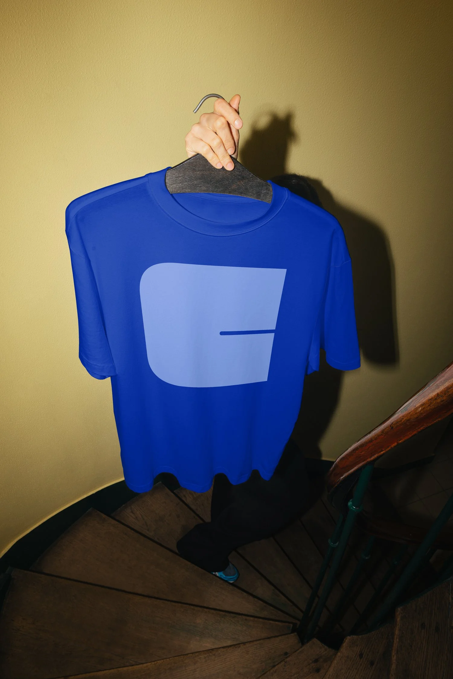
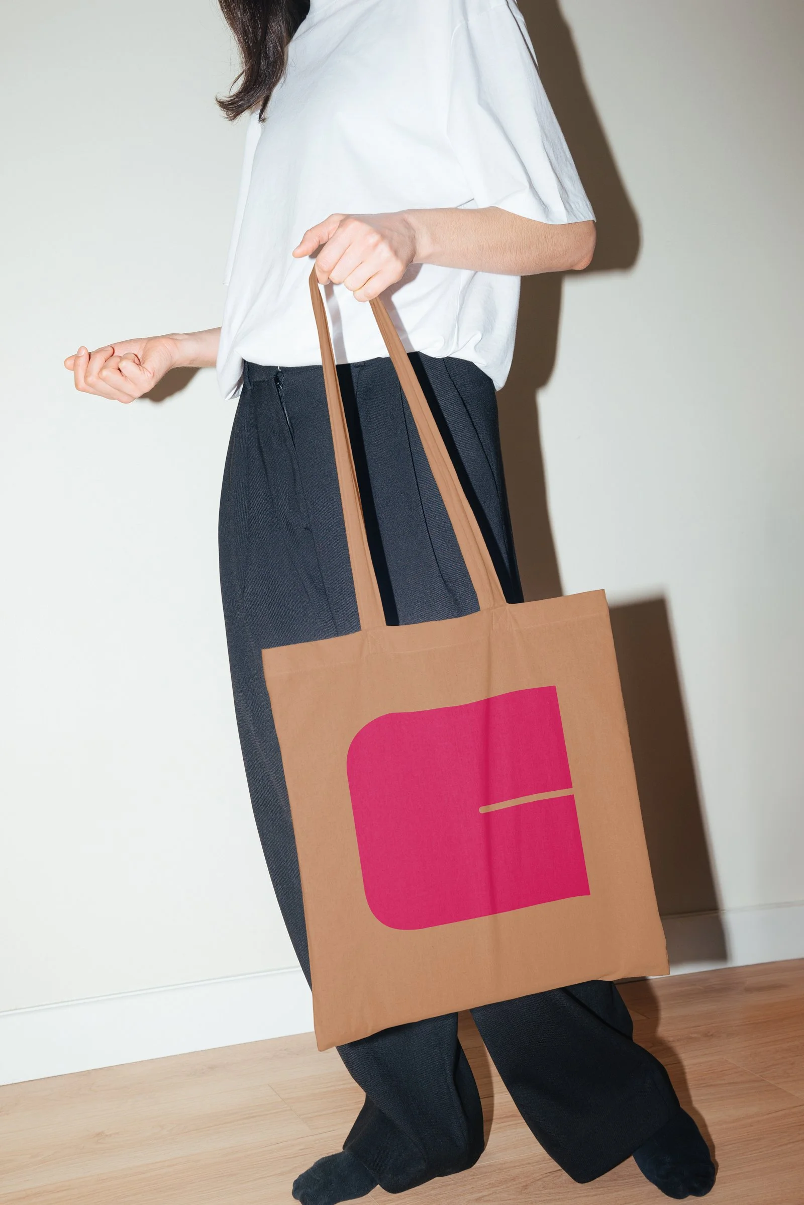
CLIENT: CHARLAINE CROGUENNEC, BRITTANY, FRANCE
We wanted her logo to hit as hard as the photographer’s vision. A striking “C,” built with the FS Pele typeface — a nod to Pelé, the legendary Brazilian football icon. The name is then paired with Montserrat, creating an intentional contrast between ultrabold and ultrathin weights, stacked into a sculptural four-level logotype. Also — the blue, a subtle wink to Klein.