Belette — translating silver into print.
Belette, named after the smallest carnivorous mammal, carries a personal story—a nod to the founder’s mother, who has called her “weasel” since childhood. This playful, intimate character guided the creation of a visual identity both delicate and versatile.
-
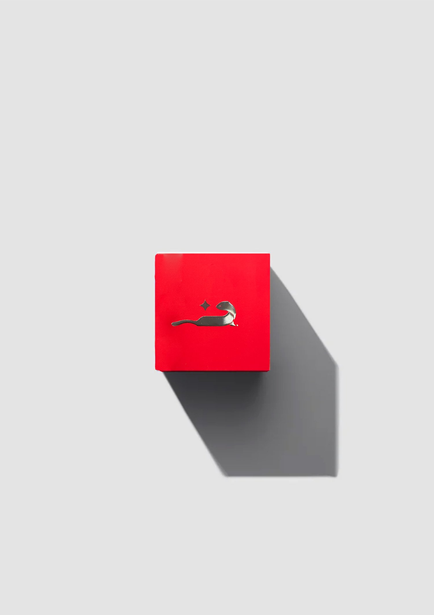
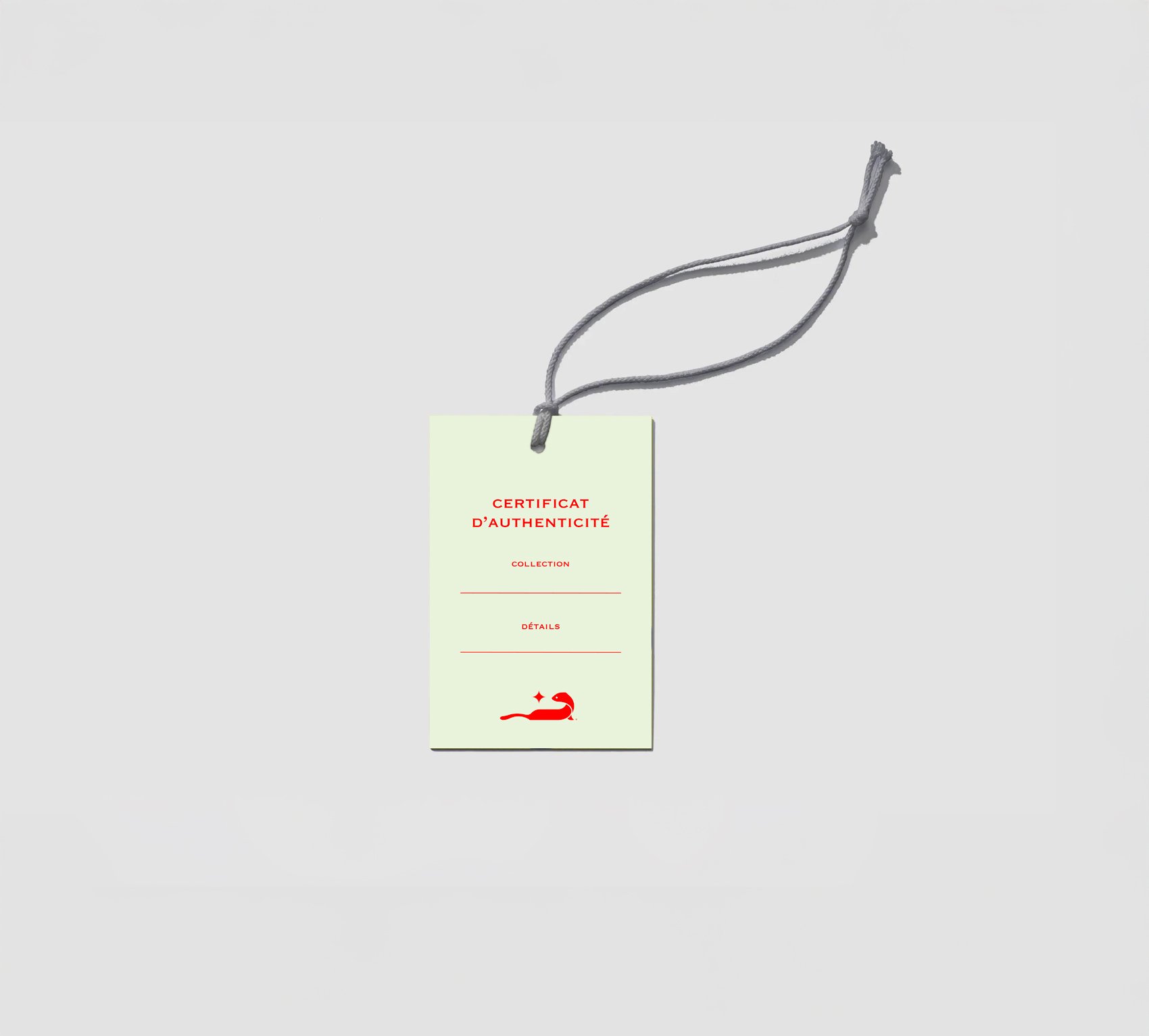
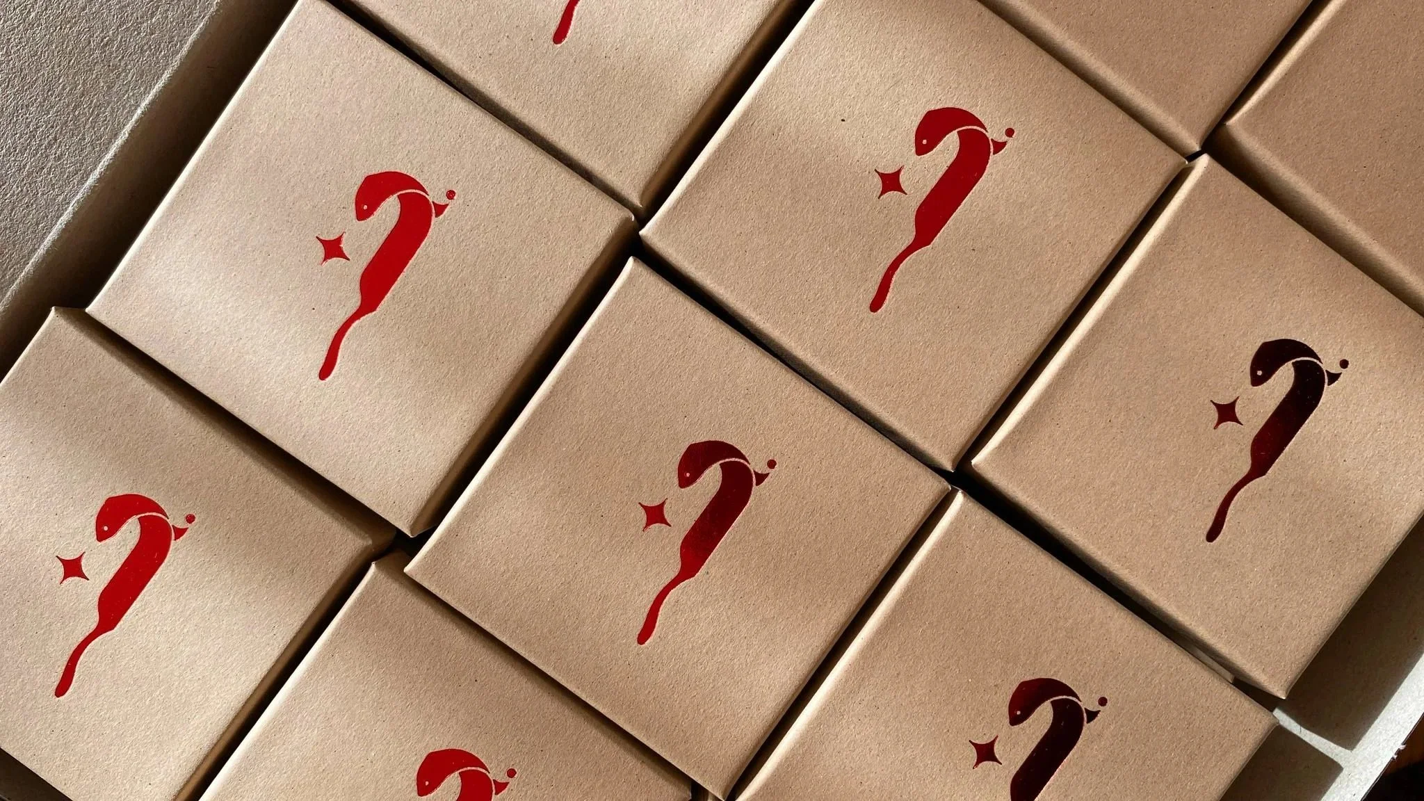
Belette, French for “weasel,” is a jewelry brand structured around thematic drops, which is why the identity needed to remain neutral and flexible, capable of accommodating a wide range of creative directions. The weasel emblem was conceived as a highly stylized, vector-based mark, its long, slender silhouette conveying elegance and agility, while a star introduces an oneiric, narrative dimension.
The identity truly comes alive through its interaction with material and light: silver treated with relief and gloss contrasts with matte red surfaces, creating depth and subtle tension. Cohesion is reinforced through careful production choices, including metallic red inks, silver foil, halftone textures, relief, and gloss.
Typography was selected with equal attention: Copperplate, with its assertive capitals and timeless elegance, adds a subtle classical note. Overall, the identity remains minimal yet assertive, translating seamlessly across print, packaging, and digital media.